


Massachusetts Pet Safety Brochure Design

Step 1 - understanding the problem

I care deeply about pets and I wanted to make a brochure that will cause people in Massachusetts to take pet safety seriously. This is because I have known many people throughout my life that have little to no regard for the safety of their pets. For example, some people think they can just leave their pets outside all day in the winter. Other people just might not be aware of the signs that a pet is in danger from the cold. That’s why I saw an opportunity to communicate this need to the public. I wanted the message to be both clear and conveying a sense of urgency.
Step 2 - Research and inspiration

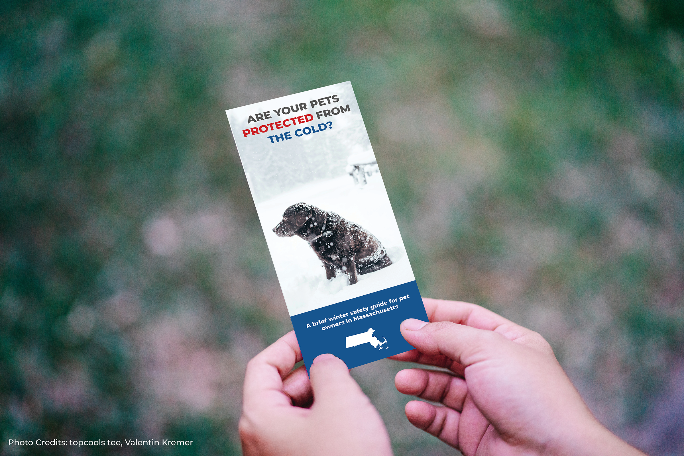
I looked at some of the most successful public service announcements that had been used in the past. Back in the days when everyone was watching television networks instead of their streaming services, PSAs were on all the time. They had many different tones depending on who their audience was and what they were trying to say. However, I knew that I needed to get inspiration from a public service announcement that conveyed a sense of urgency to the audience. One such PSA that came to me was Tom Gregory’s classic “It’s 10PM, do you know where your children are?” I like this PSA because it not only causes alarm to the target audience (parents), but it also conveys a sense of responsibility. The saying inspired me to put together the phrase “Are your pets protected from the cold?” (Tedium article providing PSA history)
Step 3 - Following the Guidelines
I wanted to design this in conformity with the communication guidelines set forth by the state of Massachusetts. Luckily, the state was kind enough to post their design style guide for anyone to use. Therefore, I used the suggested Montserrat font and typographical rules in order to convey the authority of the state. There is also a comprehensive color guide that showed me which colors to use for which purposes. The style guide’s primary blue fit great with winter theme of the brochure and the emergency red was an excellent color for pointing out alarming words and phrases. (Massachusetts Design Style Guide).
Step 4 - Finding the images

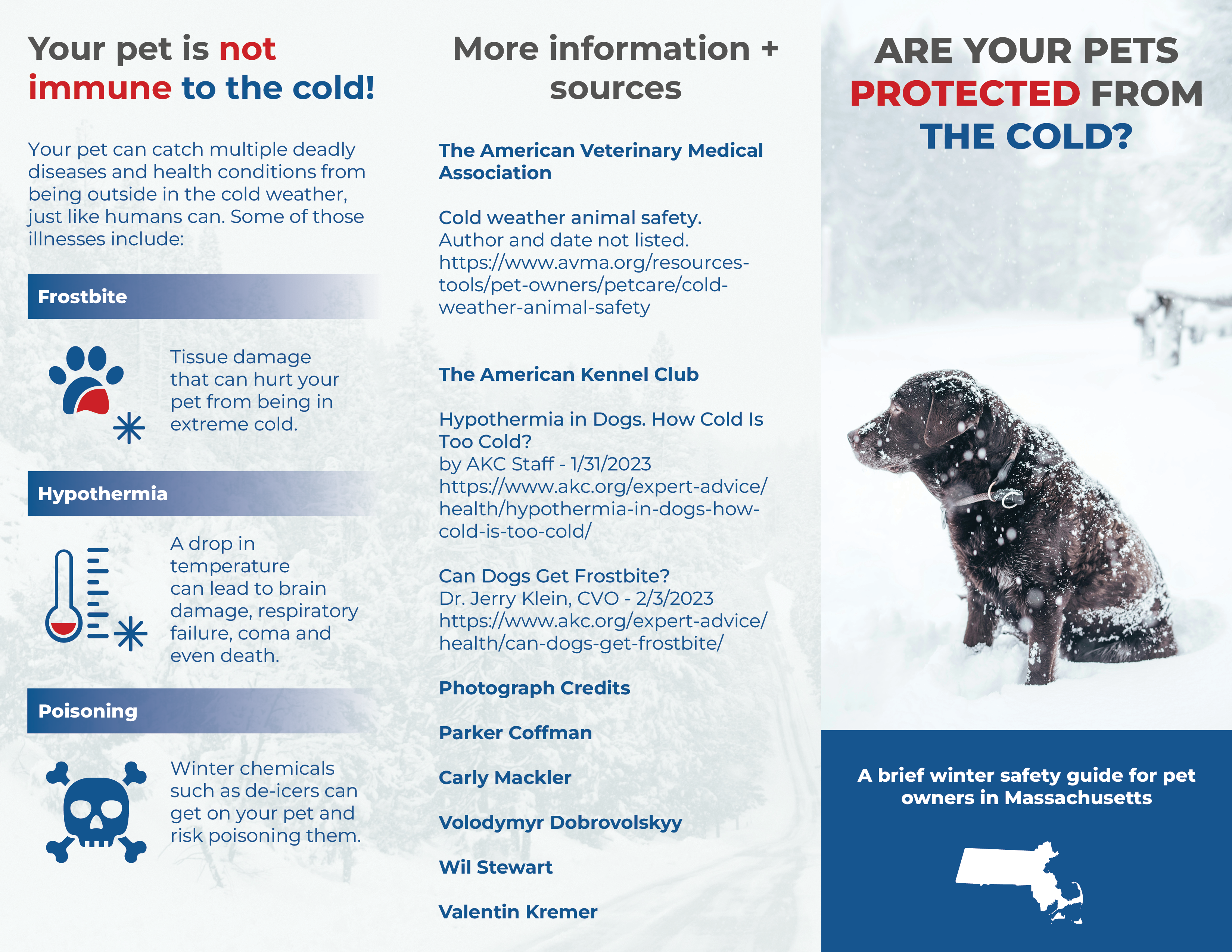
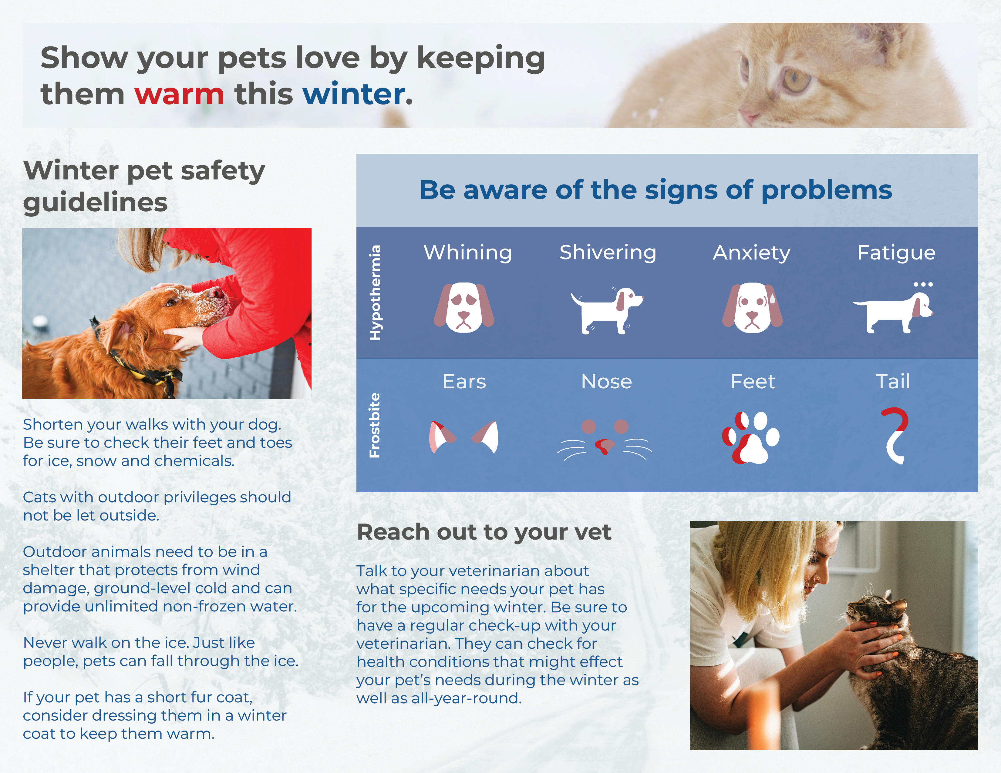
I knew that because this a serious announcement, I wanted to primarily use photos of pets to convey the importance of the issue. Unsplash is a great website that offers free, professional-quality photos to use for any purpose, other than providing a service that competes with Unsplash itself. I found a great deal of pictures of animals out in the snow. They did a great job of conveying a pet’s dependence on their owners for protection in the winter. Some editing to the photos were necessary to ensure that the text would remain legible when overlayed on the image, but they worked great.
Step 5 - Making Icons
The photos are great, but they could not portray everything I wanted in the brochure. For informative imagery, such as in the infographic above, I made icons instead. I used the state color guidelines again to style these icons. Most of them used the suggested neutral colors as a base. However, I continued to use their emergency red to point out areas of alarm.
Step 6 - Assembling the solution
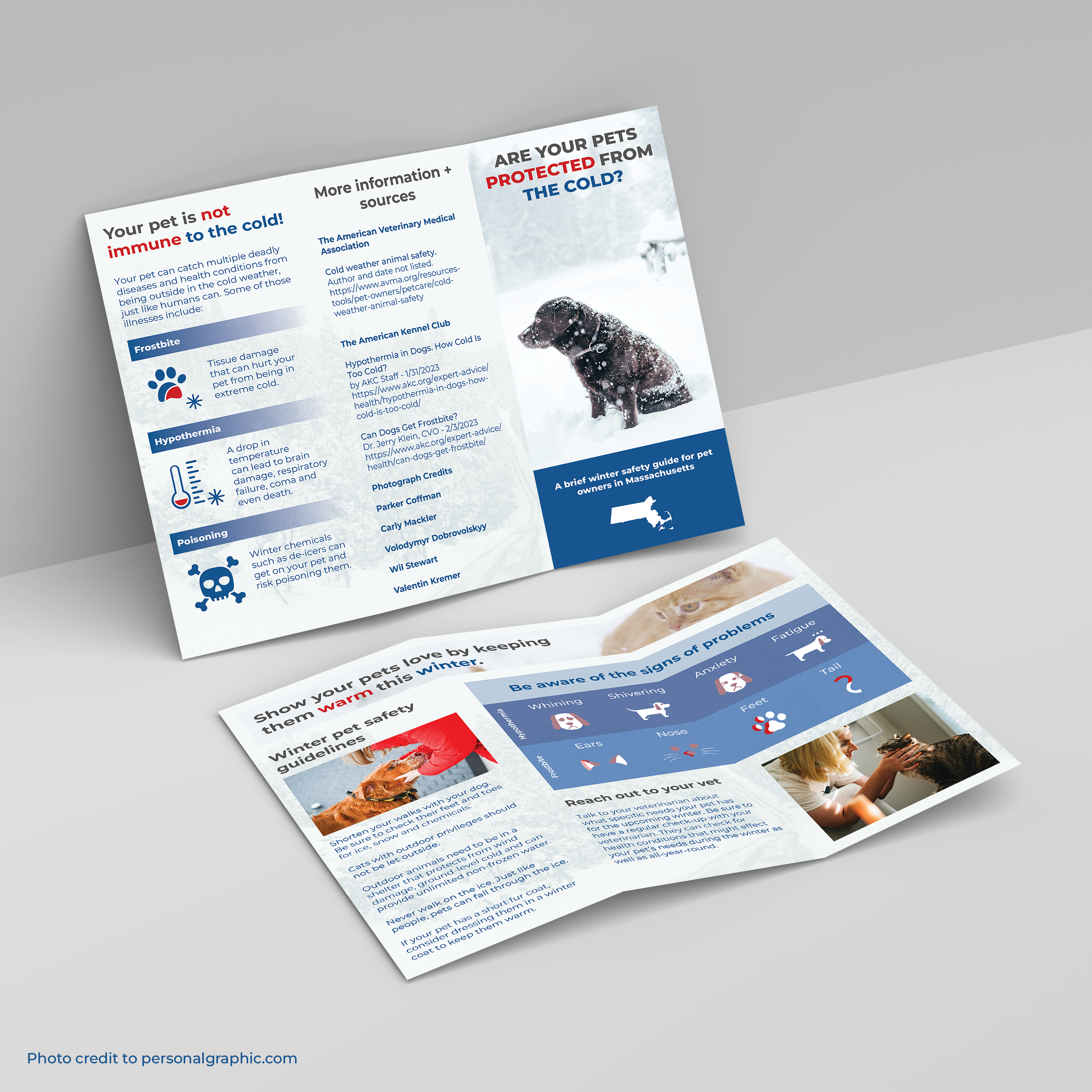
Now that the style and communication have been established, the next and final step is to go into Adobe InDesign and assemble the brochure. The final result is a printed PSA that matches the style of the state of Massachusetts while conveying the tone needed to the audience.