
Logo and Book Cover Design


Step 1 - understanding the problem
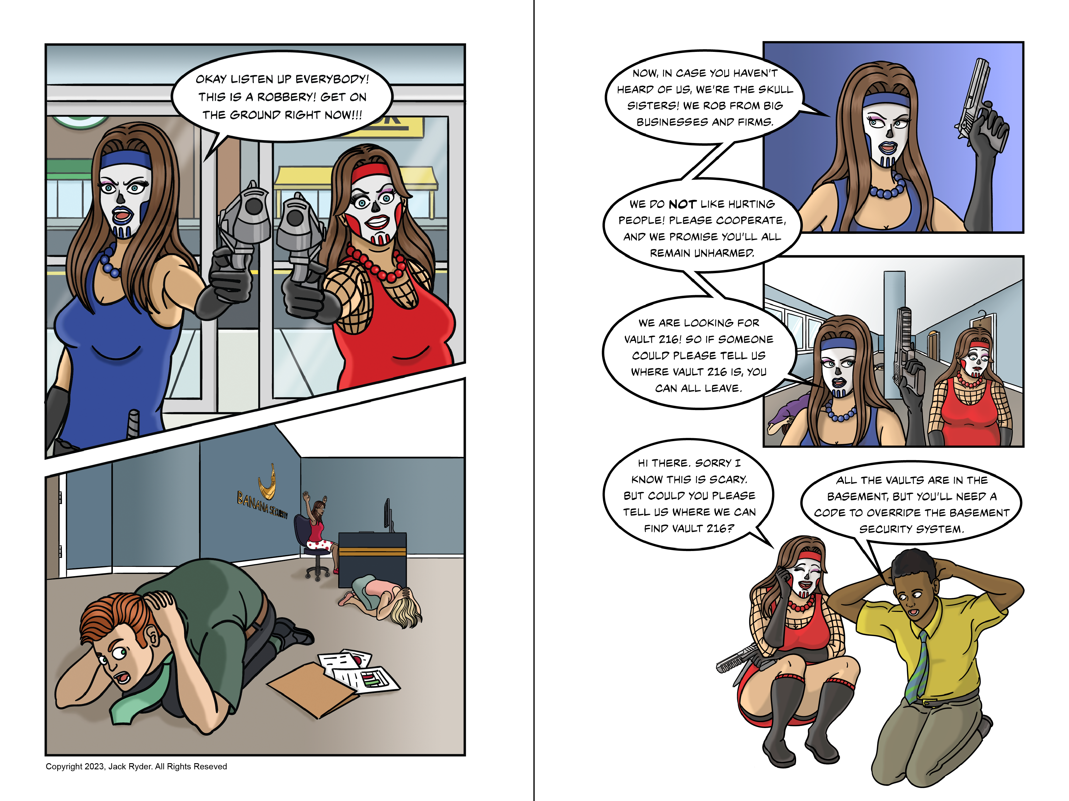
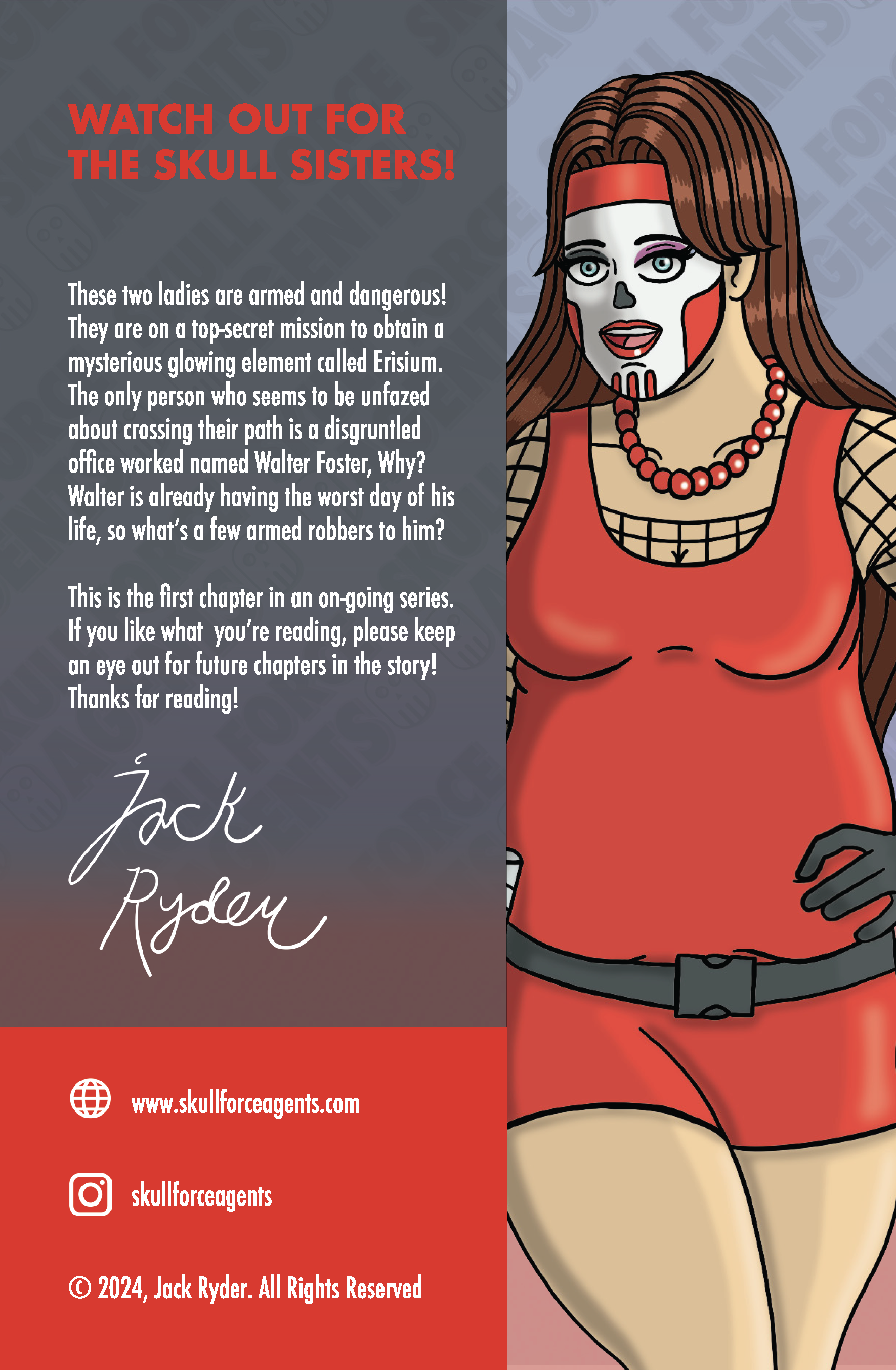
I have always loved comic books. I love the storytelling, illustration and design that goes into making them. In 2019, I decided I wanted to finally make one of my own. That idea eventually turned into a graphic novel series called Skull Force Agents. This is an action comedy series where I combine my love of cartooning with my sense of humor. It took four years of writing, drawing, coloring and editing but I finished my first volume in September of 2023.
However, when the pages were finally done, I needed to design a logo to represent the book’s brand. This needed to be something that was not too complicated, but effective enough in explaining what the comic was about. This required me to put careful thought into the iconography and typography of the logo. It had to be something that conveys action and reflects the skull theme of the main characters’ design aesthetic.
Step 2 - Sketch the solution
The first thing I did was sketch out some ideas that conveyed the concept of what I wanted the logo to be. I wanted something that was going to be exciting and impactful to the viewer. I decided even before I chose a typeface that I wanted a san serif. This is because san serifs, in general, are more modern-looking and convey action in a much stronger way. A good san serif font will allow the design to feel “big” and leave an impact.
Sometimes this step can be done on paper, especially when collaborating with others. In my case, it was easier for me to do this step in Adobe Illustrator. This is because I was able to experiment with the different transform and perspective tools to see if I came up with anything I liked. Playing with software features will often pleasantly surprise me.
Step 3 - Refine The Solution

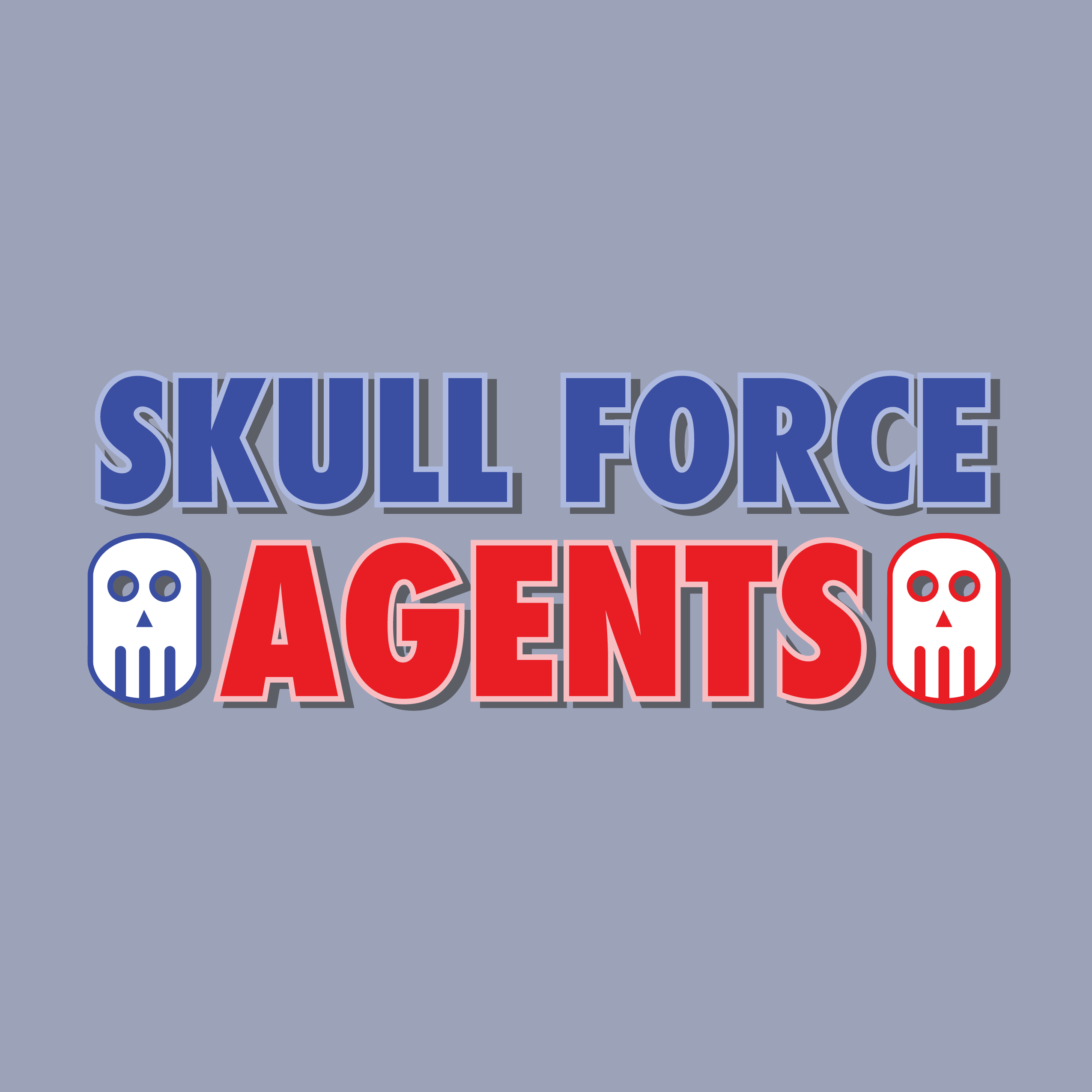
I then moved on to working with the sketches I made to refine them into a logo. I ended up choosing Paul Renner’s strong san-serif font Futura. I like how Futura is both sharp and imposing, making it the perfect choice for Stanley Kubrick’s 2001: A Space Odyssey.
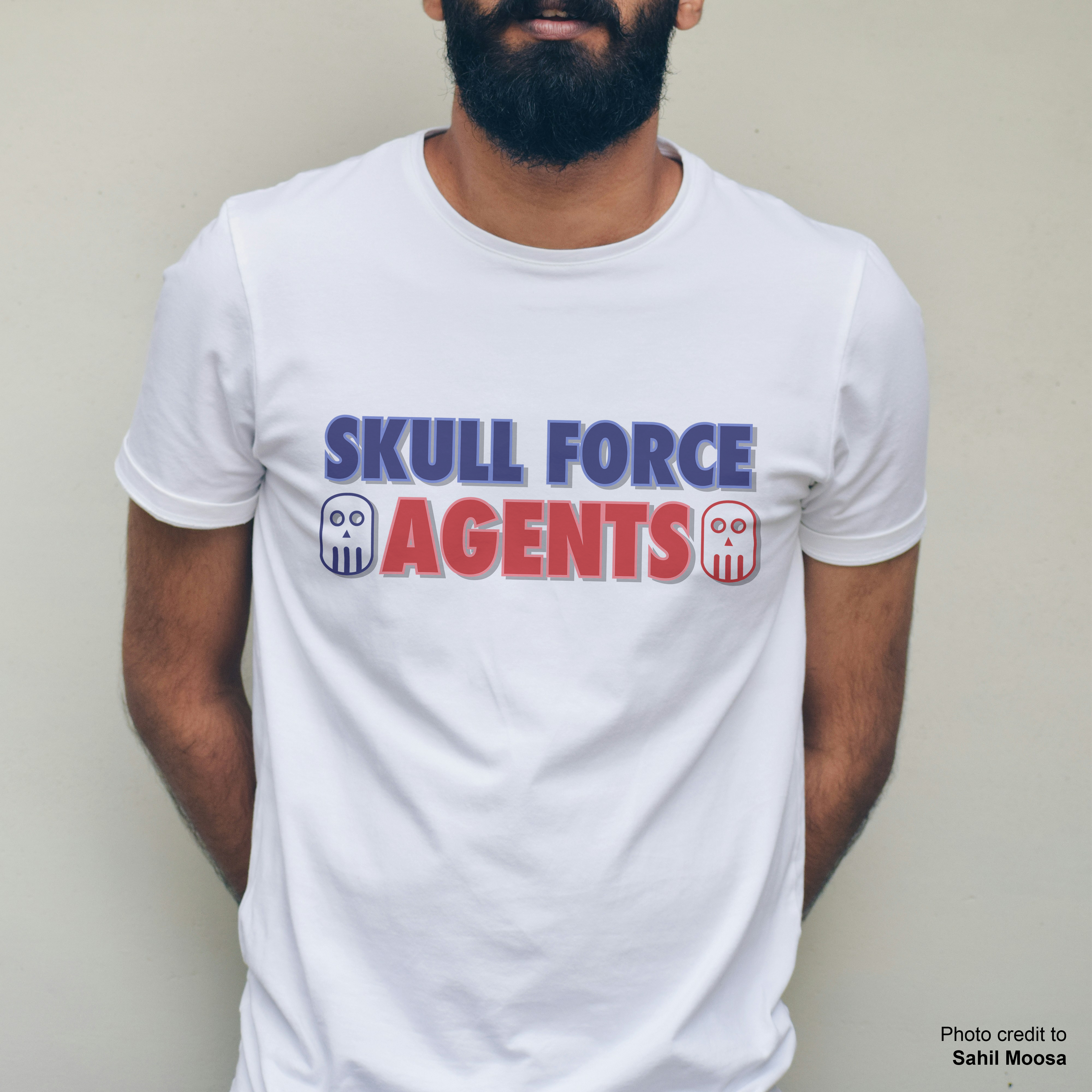
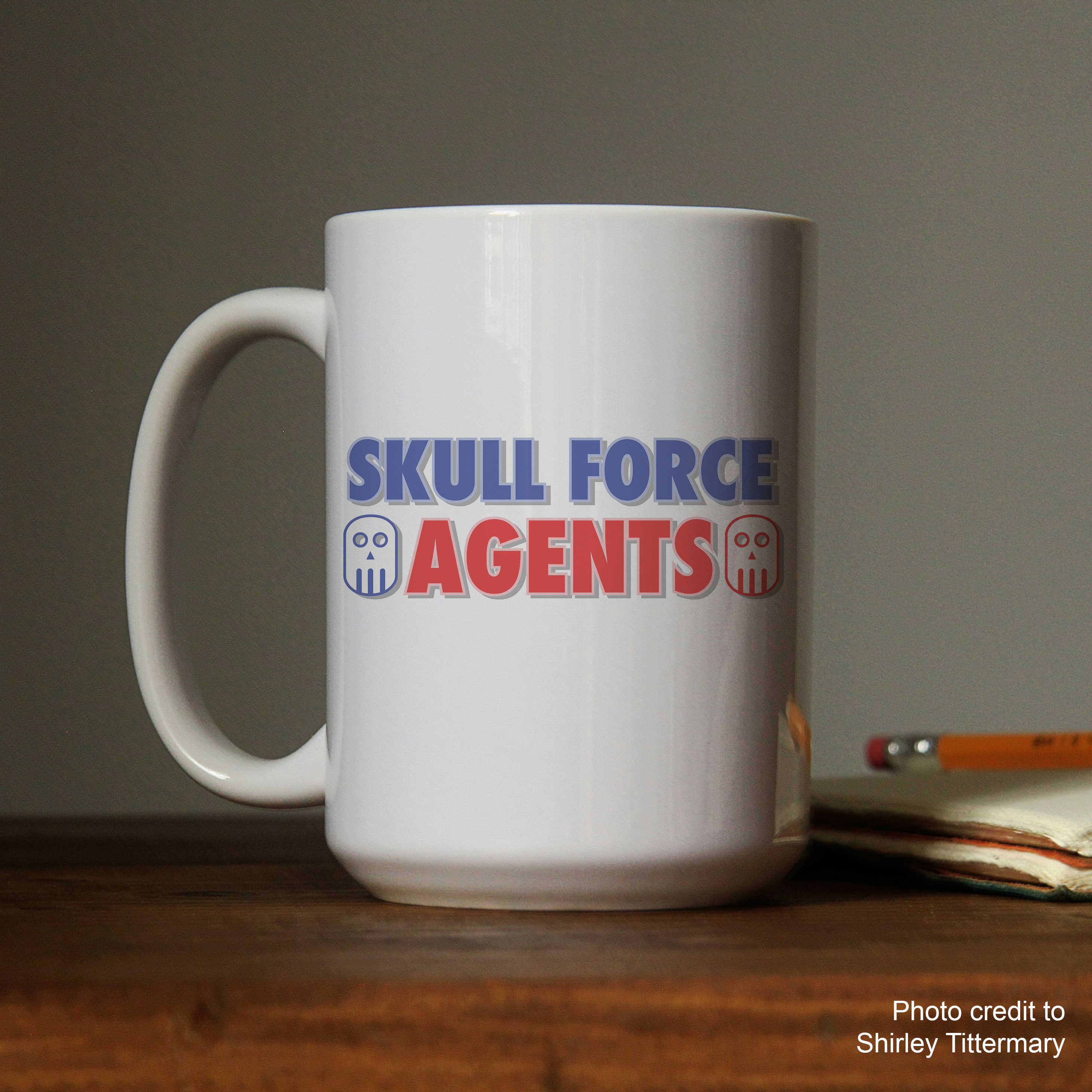
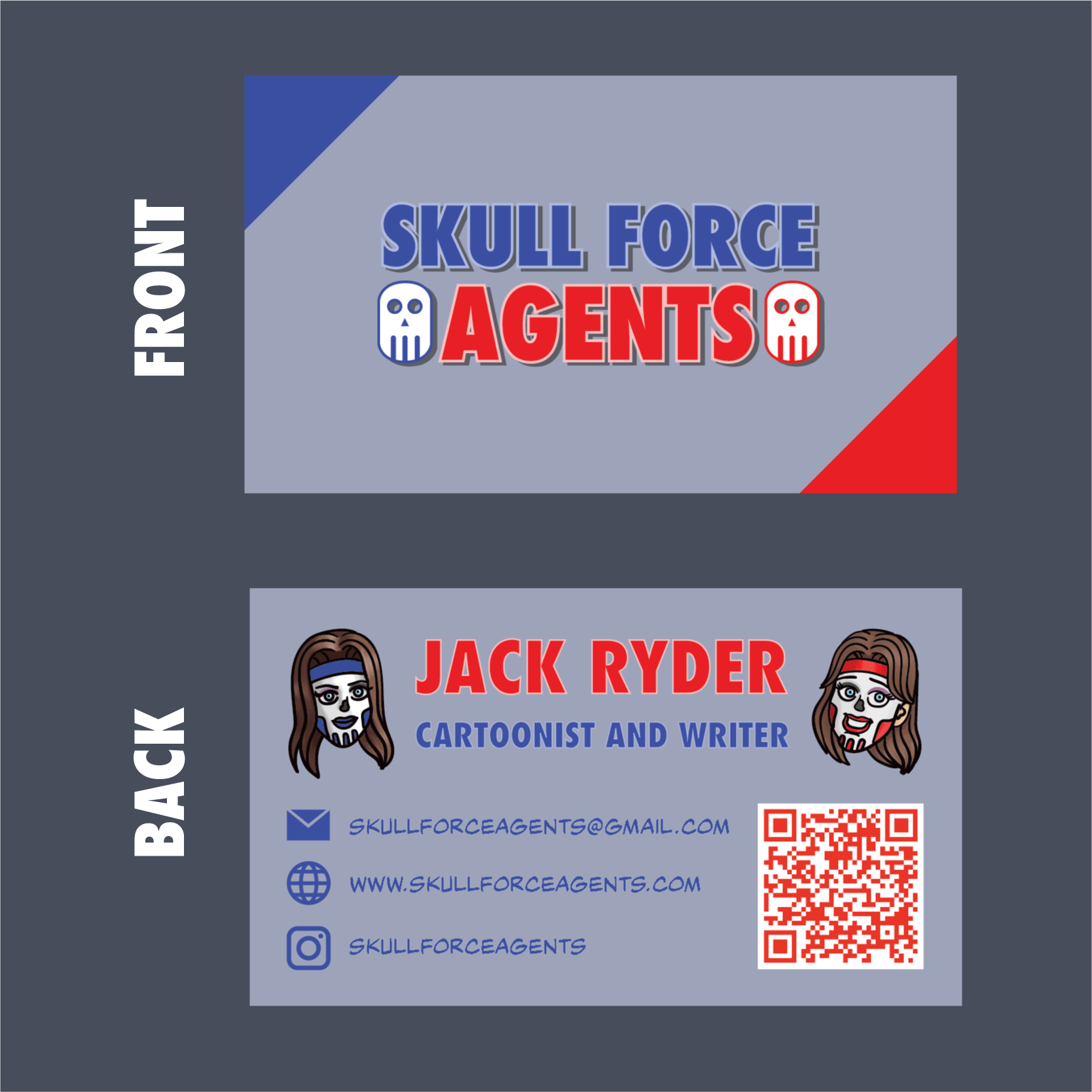
I also decided from this stage that I wanted to include an icon within the logo that could be used to represent the brand. This icon represents the skull makeup that my characters wear, but it designed in a way that it can bee seen at a very small size. As such the icon also was a great choice for the website’s favicon.
At this stage, I did not use color. I wanted to make sure that I liked the logo for itself while avoiding any bias towards color.
Step 4 - Finalize The Solution
The next step was deciding a color palette. This step was obvious as my two main characters use blue and red as major identifiers to their characters. I decided that I wanted to use an outline on the logo and a drop shadow in order for it to look similar to other comic book logos in the industry. Some great examples of logos that do this are the logo for the Scott Pilgrim series of books by Bryan Lee O’Malley and the Batman Adventure comics by Bruce Timm. The final result is a logo that represents the brand of my comic book and can be applied anywhere I need it to.
Step 5 - Applying The Solution

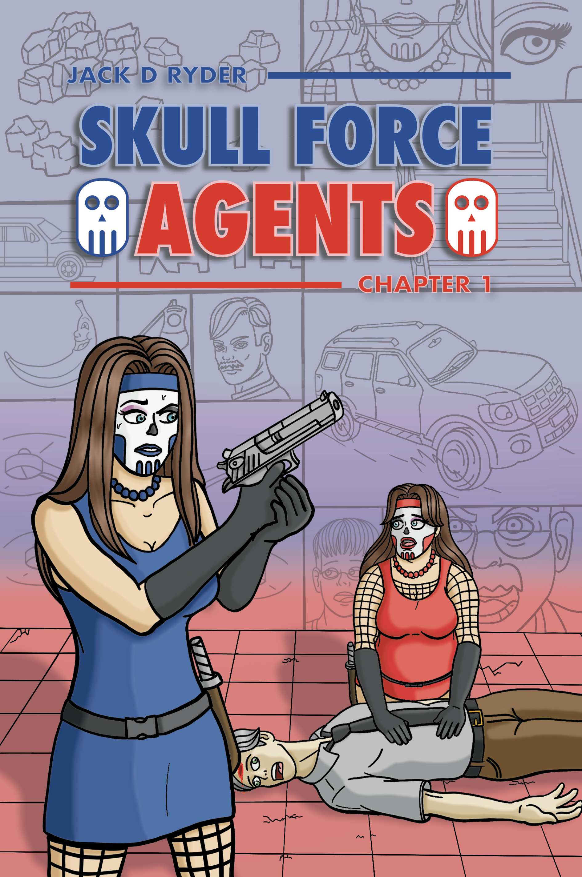
Now that a logo, icon, and color theme had been established, I used Adobe Indesign to place assemble the cover with the new logo up top. I also used the same themes for my advertisement and promotional material. Feel free to check out the book for yourself at www.skullforceagents.com.